
Color is vital to brand identity. Did you know that 60% of people like a brand based on the color and if they are attracted to it? (Elle & Co.)
Color has the power to affect moods, promote action, and convey a message. Think about the color red and what immediately pops in your mind…

Red is one of the primary colors, and a universal symbol of passion, anger, and excitement, red is a popular color in branding because it immediately grabs your attention, think of a stop sign or a red light! If you’re looking for a loud, playful, and youthful brand image incorporating red is an ideal option.
White (Space) While white isn’t technically a color the white space and highlights work to provide contrast and sharpen the background of your logo/brand. White is a reflective color that represents purity, sophistication and efficiency. Brands trying to convey a level of exclusivity and luxury often use white to evoke these thoughts.
Yellow • This warm color is the shining example of friendliness and cheer. Brands seeking to draw consumers in with a comforting message and youthful energy should consider using yellow. Too much yellow can be overpowering, and secondary colors must be chosen wisely.
Orange is yellow’s more playful and energetic cousin. It mixes a more invigorating and active emotion associated with red while employing yellow’s mellower tones. Orange is great for brands looking to elicit feelings of vitality and happiness and is often a great complementary color. Its aggressiveness tempered by friendliness presents a great color for calls to action.
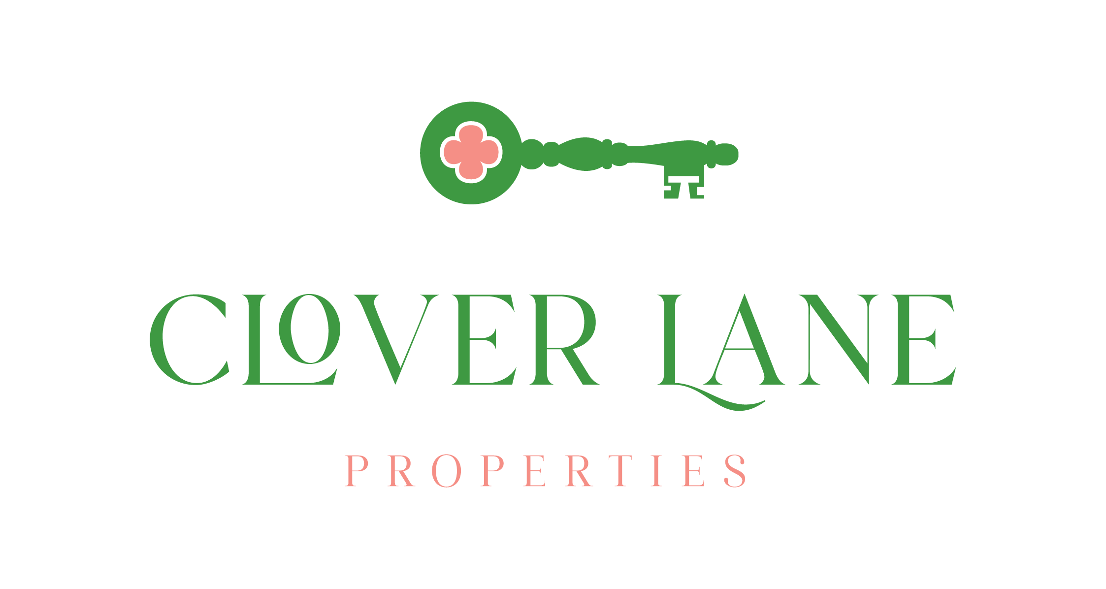
Purple • For brands trying to exude an air of sophistication and exclusivity, purple is a top choice. Many choose this color to not only exude sophistication, but creativity and calm as well. Purple is a top choice by cosmetics and high-end retailers. Purple is not to be used for a product or message with a broad appeal. Down-to-earth brands should avoid purple or use very sparingly.
Green is a more restful color, as it doesn’t force the eye to make adjustments. The color suggests balance, calm, prosperity, and a connection to nature when used with complementary colors. Brands looking to portray an opportunity for fresh starts and security should consider green as a way to relax the consumers’ mind. It doesn’t pack much of an energetic punch, so those looking to make a bold statement may not want to pursue this color choice.